NHMFbrand guidelines
The key brand resources and fundamentals for our company brand. Find logos, colours and typography specs.
To download any of the items, just right-click, and save image. For convenience, you can also download all assets, including svg versions of the logos below:
Download all assetsCompany logos
The classic NHMF Logo comes with a few variations. The dark blue crescent moon and an alternative white crescent moon for lighter backgrounds.
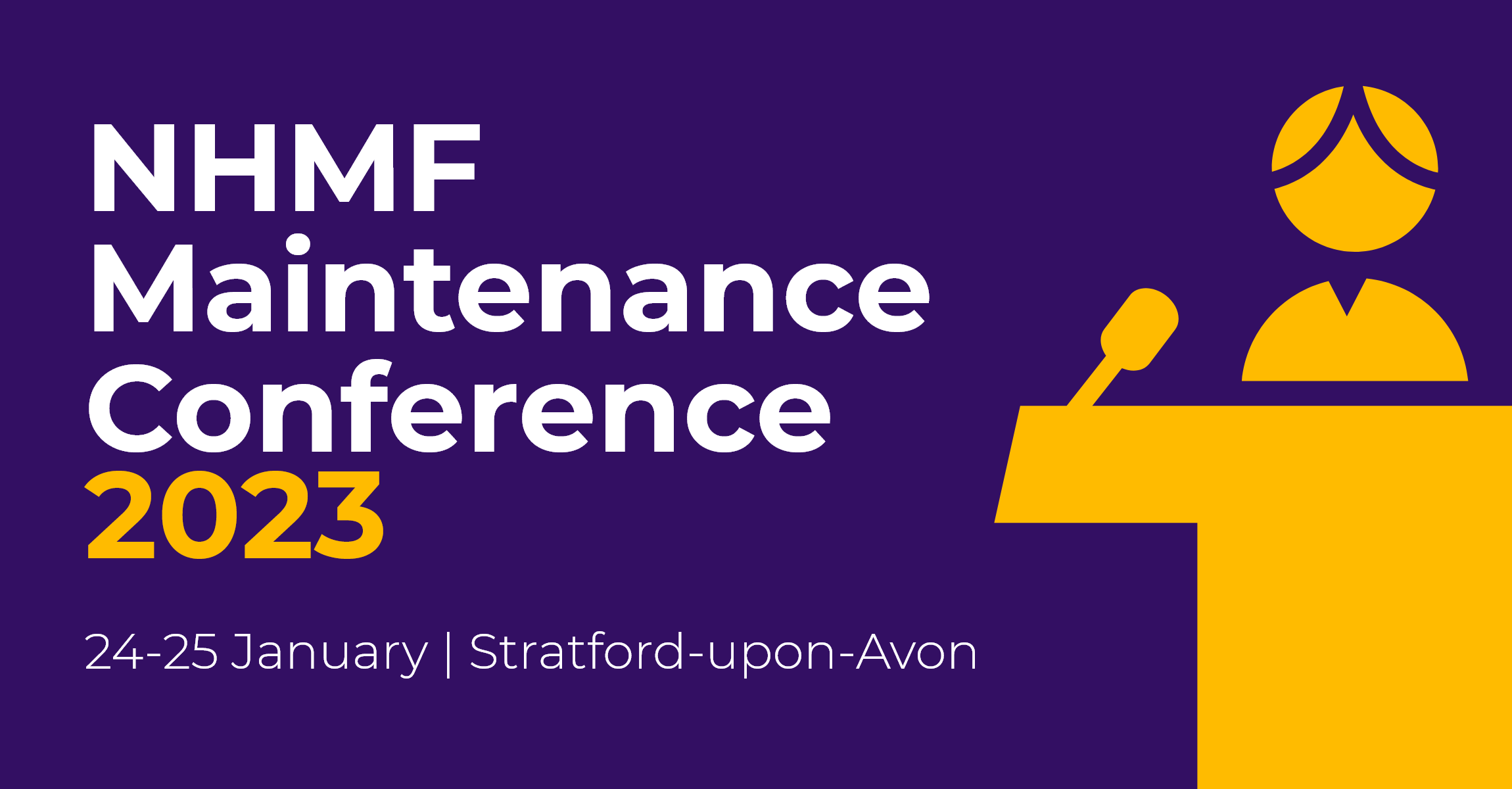
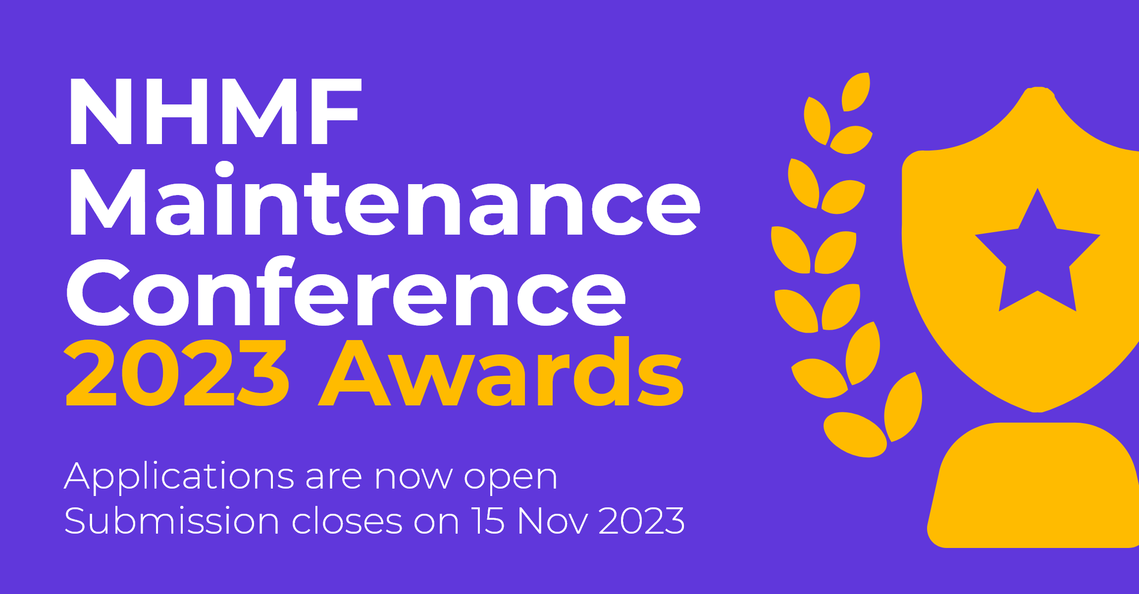
More recently, NHMF have been adopting the NHMF Conference's bolder branding approach and is likely to transition to more of it going forward.

Service Provider Forum logos
Conference logos


Primary colours
Conference colours
Typography
Montserrat is the standard typeface for the NHMF on the web, print, and desktop applications and presentations. You can download the font from here.
For emails however, we use Arial / sans-serif / system fonts.
Extra large heading
Large heading
Normal heading
Paragraphs
Lorem ipsum dolor sit amet consectetur adipisicing elit. Dignissimos aut beatae voluptates magni inventore quae. Qui distinctio perferendis dicta temporibus eveniet voluptatem tempore aspernatur, quas saepe provident sunt maxime odit!
Lists
The default list for desktop applications should be fine, but make sure to keep the line spacing at 1.6. Additionally, when the list consists of full paragraphs, please separate each paragraph with a margin bottom of 15px.
For the web howerver, all bullet list will use an 8px light purple bullet and all list item containing a 30px padding left to accomodate its position
- Lorem ipsum dolor sit
- Lorem ipsum dolor sit
- Lorem ipsum dolor sit
- Lorem ipsum dolor sit
- Lorem ipsum dolor sit
Sample usage
The main design revolves around simplifying everything, with the aim of reducing eye strain using negative space.
Bold headers are paired with high contrast font size and weight to give prominence. This is to be observed throughout all the materials moving forward.
Simple icons are also used to create visual interest without causing clutter.
